Summary: Weather Analysis
(Latitude vs. X)

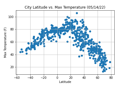
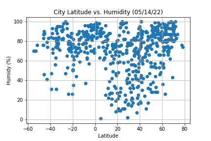
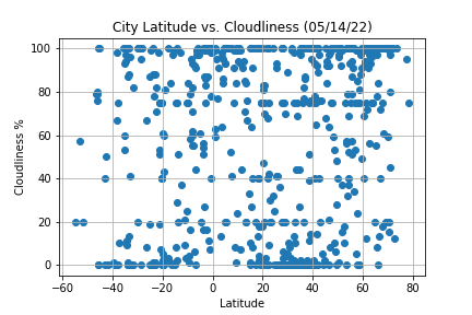
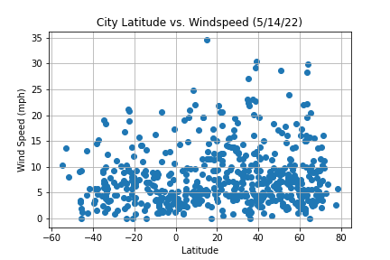
The purpose of this analysis was to show the impact the equator has on changes in weather. Data was collected and assembled from approximately 500 random cities from around the globe by utilizing OpenWeatherMap API and observing different measures based on latitude.
Matplotlib was used to showcase a series of plots which include the factors of temperature, humidity, cloudiness, and wind speed. Observations in this site, also provide explanations and descriptions of the trends and correlations observed.


